How to turn SVG icons into React, Vue and Svelte components
Clean the markup, use currentColor, pick good names and export typed components your codebase can import.
Inline SVG components are the most flexible way to use icons in a web app. They inherit text color, scale with font size, need no extra network request and can be tree-shaken so you only ship the icons you use.
Turning a folder of SVG files into good components takes a few steps. Here’s what each step does and why it matters.
1. Clean the SVG markup
Design tools export more than the drawing: XML declarations, comments, editor metadata, empty groups, IDs such as “Layer_1” and sometimes a fixed width and height. None of it helps in production, and some of it hurts. Duplicate IDs collide when several icons share a page, and fixed sizes fight your CSS.
Run every icon through an optimizer before it reaches your codebase. Iconset optimizes SVGs on import and when exporting, and SVG Doctor finds files that still need attention.
2. Use currentColor for single-color icons
A single-color icon should use fill="currentColor" or stroke="currentColor" instead of a hex value. The icon then takes the color of the surrounding text, so hover states, dark mode and disabled states work with plain CSS.
Multicolor icons and illustrations should keep their colors. Iconset’s exports apply currentColor only to icons that use a single color.
3. Keep the viewBox, drop the size
The viewBox defines the icon’s coordinate system and is what lets it scale cleanly. Width and height should come from props or CSS. A common pattern is width="1em" height="1em", so the icon matches the font size of its container.
4. Choose component names
Components need PascalCase names that are valid identifiers: “arrow-left.svg” becomes ArrowLeftIcon, and a name that starts with a digit needs a prefix (“3d-box” becomes I3dBoxIcon). A consistent suffix such as “Icon” avoids clashes with your own components.
5. Export the components
In Iconset, select the icons (or a whole set), choose Export and pick a format:
- React: one typed .tsx component per icon plus an index file that re-exports them all.
- Vue: single-file components.
- Svelte: Svelte 5 components.
- SVG sprite: one file with a <symbol> per icon and a preview page.
- CSS icons: mask classes with data URIs, handy when you can’t use components.
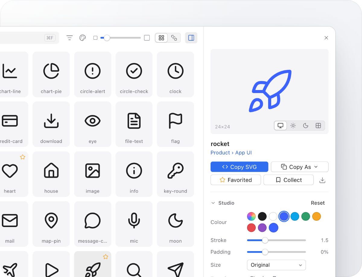
For a single icon, the inspector copies the same code straight to the clipboard: SVG, JSX, React, React Native, Vue, Svelte, Angular, a data URI, Base64 or CSS.
6. Use them
With the React export, usage looks like this: import { BellIcon } from './icons', then <BellIcon className="text-gray-500" />. Every prop you pass lands on the <svg> element, so aria-label, onClick and style work as you’d expect.
TipDecorative icons next to a text label should be hidden from screen readers with aria-hidden="true". Icons that stand alone, like an icon-only button, need an accessible label on the button.
Keeping components in sync
Treat the exported folder as generated code: don’t edit components by hand, re-export when the library changes. Because names are derived from file names, renaming an icon in the library is the only change you need to make.
Try Iconset free
A fast icon manager for Mac and Windows, with 100,000+ open-source icons built in. Free for up to 500 icons, with a 14-day trial of every Pro feature.
Download IconsetSee all features